>where the sales people are

>Today was a travel day, mostly. I’ve been on the go now for 16 hours. The goal: get to Vegas for my company’s World Wide Sales Conference. Just in case you’re wondering, that’s 5,400 sales people all in one place, and yes it’s insane.

I had to get to the airport at 5:00 AM. The lines were crazier than I had ever seen. Then, after sitting in a United Airlines plane for an extra couple hours because of a malfunction that kept us from taking off, I missed my connecting flight (Virgin Air) in San Francisco. [Note: a Horizon Air mechanic actually fixed the plane. Someone commented that it might be in his interest to not fix a competitor’s plane perfectly. Nervous laughter.] San Francisco was a mob as usual. Fortunately Virgin Air had a later flight from SF to Vegas.

I have to say that the difference between United and Virgin is the difference between darkness and light. I love Virgin Air. New planes, nicer people, hipper styling, giving everyone on the plane a gift, etc. Too much to go into now, but I recommend them if you have the chance.

Also, it was no fun arriving three hours late to the hotel only to find they did not have the room ready. Finally I got a call on my cell from the front desk telling me the room was now ready – at 7:30PM!! Fortunately the rooms at The Palazzo are posh.


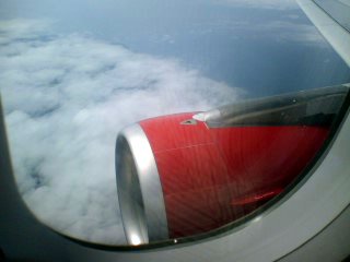
Somewhere East of San Francisco


The cool/funky interior of Virgin’s plane.


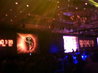
The first General Session of the sales conference. 5,400 people, rock music, gigantic video screens, and the superstar CEO. It’s quite a show.


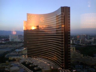
Looking out my hotel window.

Finally, I used to think that a cell phone was the coolest thing, then I thought a cell phone with a camera was the coolest thing, now I am generally appalled at the poor quality of my phone’s pictures. What is the world coming to? What have I become?

>grab the details

>For some time now my credit union has been running an add for free tunes when one signs up for their free checking. The campaign, I believe, is targeted toward college students. I mean, who else would want free tunes, or think that’s a good enough incentive to open their first checking account after moving out of mom and dad’s place?

I have to say, however, that I am curious about the visuals.

This image has been popping up on the credit union’s web site for about a year now, and it kinda disturbs me (in a humorous way, I must say). What is going on here? Along with the text I see two young hip college students apparently very happy about the free tunes with the free checking. They look like they are dancing.

Obviously their visual relationship is a construction, they are not in the same space in reality but have been manually juxtaposed by the graphic designer. So the image is a manipulation. They form a kind of visual unit that has been constructed to create a particular effect, whether conscious or subconscious. What that effect is remains to be seen.

The man stands, leaning back, pelvic forward, right arm extended outward and slightly up. His legs are spread, and he has a kind of hip college confidence. The woman also standing leaning back, also pelvic forward, her arms at her sides. She appears to be standing between the legs of the man. There is a kind of forced intimacy, forced in that the arrangement is arbitrary. The look on her face, with her mouth wide open, is one of delight, as though she is exclaiming something joyous, or maybe she is ready to take a bite of something.

In effect, without appearing to acknowledge each other’s presence, these two seem to be presenting their clothed bodies to each other.

And notice the angles. Her body position, and especially her left arm, makes a definite line angling downward to the right. That line seems to end, it would seem, at the man’s crotch. The man’s body angles up to the right. His arm and his gaze angle up to the left. If we were to draws lines to represent these visual vector forces, they might look like this below:

A triangle of vector lines is the most common of visual constructions. It mentally ties together visual elements, creating visual relationships that weave connotations for the mind to land upon.

So what does this mean? Honestly, I can’t say for sure. If I had to come up with something I would say the man is represented as being strong, masculine, and erect (symbolically emphasized by his arm thrusting outward). The woman is represented as being more diminutive than the man, not merely because she is smaller, but because she is placed in a lower position than the man. She seems to be focused on the man’s crotch, with a look of extreme delight. I don’t mean to be crude. I am just stating the obvious.

Finally, on the left-hand side of the image there is the phrase “Grab the details.” The clickable triangle/arrow that goes with the phrase is on the same visual plane, and pointing in the same direction, as the woman’s hand and the man’s crotch. Is she the one who is going to grab the details? One wonders. Again, I don’t mean to be crude.

I don’t think this image needs my interpretation or evaluation. One can make of it what one wills. But it reminds me of the advertising I studied at university in media studies. And I find it funny to see it on my credit union’s web site. I also find it rather peculiar. Why does a credit union have to use such advertising, whether stupid or sexual or both, to sell checking? It’s just checking. But, then I don’t work in advertising.

the architecture at work

It is the end of the year, and for you salespeople, it’s the end of the quarter! For me this is definitely a rushrush time of year, and work is laying a heavy and stressful load on me at the moment. Thus I found myself going in to the office both days this past weekend. I happened to have my camera with me and snapped some images of the build in which I work.

I have been interested in how the architecture and design of objects within one’s everyday world have their effects on us. Being alone in the building heightened my sensitivities to the nature of the space.


The entrance exterior.


The entrance interior.

This building is an attempt to combine inexpensive concrete-tilt-up construction (think Costco buildings) with just enough outside-Silicon Valley hipness. The truth is, this building is really just a glorified call-center and order processing center, with some IT and a few other jobs thrown in. It is also a rather simple building in terms of design and layout.

I have to say that there are some characteristics of the building and work area that I like, but I also have to say that it does not feed my soul, not that I expect it to. Like other aspects of my job, such as the good benefits and decent pay and good people to work with, this building is part of the “golden handcuffs” that make it difficult for me to dislike my job enough to leave and go pursue some personal “dream.” And of course I’m not bitter, it’s a lot better than some other places I’ve worked. It beats working on a green chain! If you’ve lived in the Northwest for very long you know what I mean.


The long atrium that runs down the center of the building. I’ve been told it’s a quarter mile long.


The little section of cubes where I work.

What I find most interesting about this building is that its antecedents go back to some of my favorite architects, le Cobusier and Gropius, and to their ideas of the relationship between form and function. In that sense this is both a modern, and in modern terms, now an old building. It is a very functional building and, in its best moments, its aesthetics are the result of great functional design. I am sometimes amazed at how many hours of my life have been spent in this building – since early 2002!